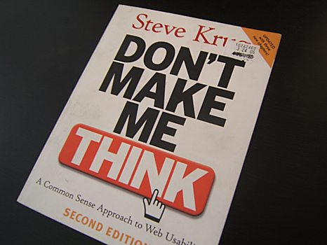
I just put down the second edition of Steve Krug’s “Don’t Make Me Think” so I’m putting down some quick thoughts about the book as a whole. For those of you that don’t know, web usability is a big topic when designing, developing, and marketing a website. Steve Krug comes from a background of years of consulting in this field and put a condensed version of what he has learned in “Don’t Make Me Think.” The book is divided into 3 main sections, usability on the whole site, usability on the home page, and how to test for usability. All said Krug does a good job of summarizing what all it takes to increase website usability while leaving the door open for more exploration.
The title alone is what someone who reads this should walk away form this book. “Don’t Make Me Think” is more of a command than just a title. When people blaze through websites, they move at a pace faster than normal conversation. Where you should choose your words wisely while talking with someone (especially someone important), you don’t have the luxury of choosing words on the fly when presenting a web page to someone. It is the responsibility of the website to make it as easy as possible from the beginning to avoid any confusion. Confusion slows people down, which will lead them to other websites.
The first part of the book talks about website usability as whole. Krug breaks it down to about 6 different parts of the page where confusion can creep. Some of them made sense and some of them were gotchas I haven’t thought of. I came away with two concepts. First, keep things simple and consistent across the whole site. Second, make the site look like some version of a tabbed catalog or book. This makes more sense when developing a business site, but the concept can be used for other purposes. Essentially, a crisp clean book with easy to search and indexed tabs will make the most of what your target audience wants.
We shoot on to the second part of the book where Krug throws that out of the window and talks about the home page. Krug says that the home page can have a different look from the rest of the site because of its welcome mat mentality. To me that meant it’s the cover of the book or catalog to flip through, and then some. You need tell them what it is and how to dive deeper, but give just enough shine to lure them away from other books. Here Krug makes exceptions to the rules, making them good rules.
The last part of the book talks about how to perform duct tape usability testing. From his experience, he maps out the hardcore way to sample a user base and record interactions with a web page for top notch results. Then, much like this book, he runs over the quick and dirty way to get comparable results with just a camera and an office. All that’s really needed is to openly discern what type of natural browsing behavior someone exhibits when hitting the website the first time. I haven’t really thought about web usability testing before, so getting a glimpse of both sides of the spectrum really help in determining where I can apply usability testing to my projects.
Out of the whole book, the part where I most identify was the downright silly arguments bred from design suggestions or decisions. Believe or not, I have been privy to some absolutely ridiculous arguments. The classic examples he provides, including the ‘technical issue’ trump card, have all been played out in front of me. I may have even dealt some out myself. The point that’s made here applies to my trials and meeting tribulations. The focus of the website should be geared toward the target audience and not one’s own beliefs. The context and content should always aim for the target audience. This is where Krug uses usability test to figure out if the site works or not. Leave it up to strangers, not someone who’s had a hand in the whole development process.
Steve Krug’s “Don’t Make Me Think” is a great read if you into making you website super user friendly and therefore super cool. If you have an afternoon pluck down and cull out the basics. The concepts within will help catch any low hanging fruit (which he suggests throughout the whole book) while not wasting any of your time building a site. Krug does gloss over some topics like Cascading Style Sheets, but that’s a monster topic on its own. Regardless, pick up this book if you want exposure to solid design principles, amateur or professional alike.
